Convergent epigenetic evolution drives relapse in acute myeloid leukemia
- Cancer Biology Graduate Program, Stanford University School of Medicine, United States
- Institute for Stem Cell Biology and Regenerative Medicine, Stanford University School of Medicine, United States
- Cancer Institute, Stanford University School of Medicine, United States
- Department of Medicine, Division of Hematology, Stanford University School of Medicine, United States
- University of California Irvine School of Medicine, United States
- Department of Pathology, Stanford University, United States
- Program in Immunology, Stanford University, United States
- Gladstone Institute of Neurological Disease, United States
- Gladstone Institute of Data Science and Biotechnology, United States
- Department of Neurology, University of California, San Francisco, United States
- Parker Institute for Cancer Immunotherapy, Stanford University, United States
- Gladstone-UCSF Institute of Genomic Immunology, United States
Figures
Figure 1 with 2 supplements
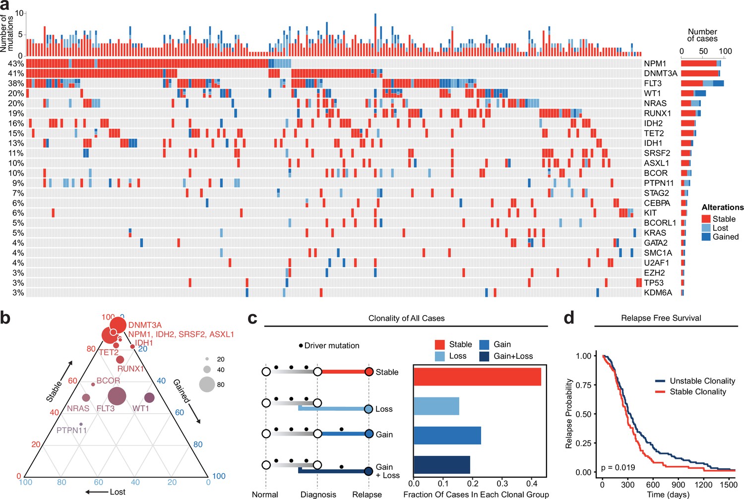
Meta-analysis of genomic change in relapsed AML.
(a) Oncoprint of recurrently mutated genes from published relapsed AML dataset. Genetic alterations are color coded according to dynamics between disease state: stable at relapse, gained at relapse, or lost at relapse. The number of gained, lost, and stable mutations as well as percentage of patients with mutations in each gene are displayed on the right and left sides of the plot respectively. (b) Ternary plot of recurrently mutated genes from dataset analysis depicting mutational dynamics between diagnosis and relapse (restricted to genes with at least 20 events in our cohort). The sides of the plot correspond to the percentage of mutations displaying the indicated dynamic (gained, lost, or stable at relapse), the size of each dot indicates the number of mutations detected for that gene. (c) Schematic of clonal ‘bins’ each patient was categorized into based on mutational data. Bar chart on the right depicts the proportion of patients assigned to each clonal bin. (d) Survival analysis of patients based on sample clonality data gathered for each patient group. ‘Stable’ clonality refers to patients with equivalent mutations detected at diagnosis and relapse, ‘Unstable’ refers to patients that had any change in mutations at relapse (log-rank test p<0.05).
Figure 1—figure supplement 1

Plots depicting change in variant allele frequency for detected ‘pre-leukemic’ epigenetic modifier mutations (a), RAS pathway mutations (b), or WT1 mutations (c) in meta-analysis relapsed AML cohort.
Lines connect samples from the same patient between disease timepoints, color coded according to mutation dynamic (red = stable, blue = gained at relapse, yellow = lost at relapse) (a, c) or according to RAS family member (b).
Figure 1—figure supplement 2
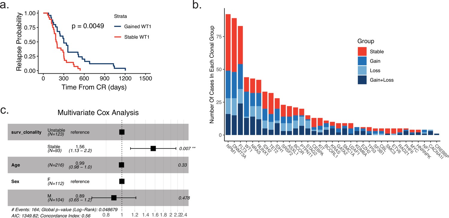
Gene-specific clonal analysis and multivariate analysis of relapse-free-survival based on clonality.
(a) Time to relapse analysis of meta-analysis cohort patients according to WT1 mutation status between diagnosis and relapse (blue = gained WT1 mutation at relapse, red = WT1 mutation stable at relapse). (b) Plot depicting recurrent mutations of meta-analysis cohort AML patients. Fraction of each bar graph depicts the proportion of mutants that fall in the designated clonal group colored according to key shown at right. (c) Multivariate Cox analysis of survival data from meta-analysis patient cohort data accounting for mutation clonality, age, and sex.
Figure 2 with 2 supplements
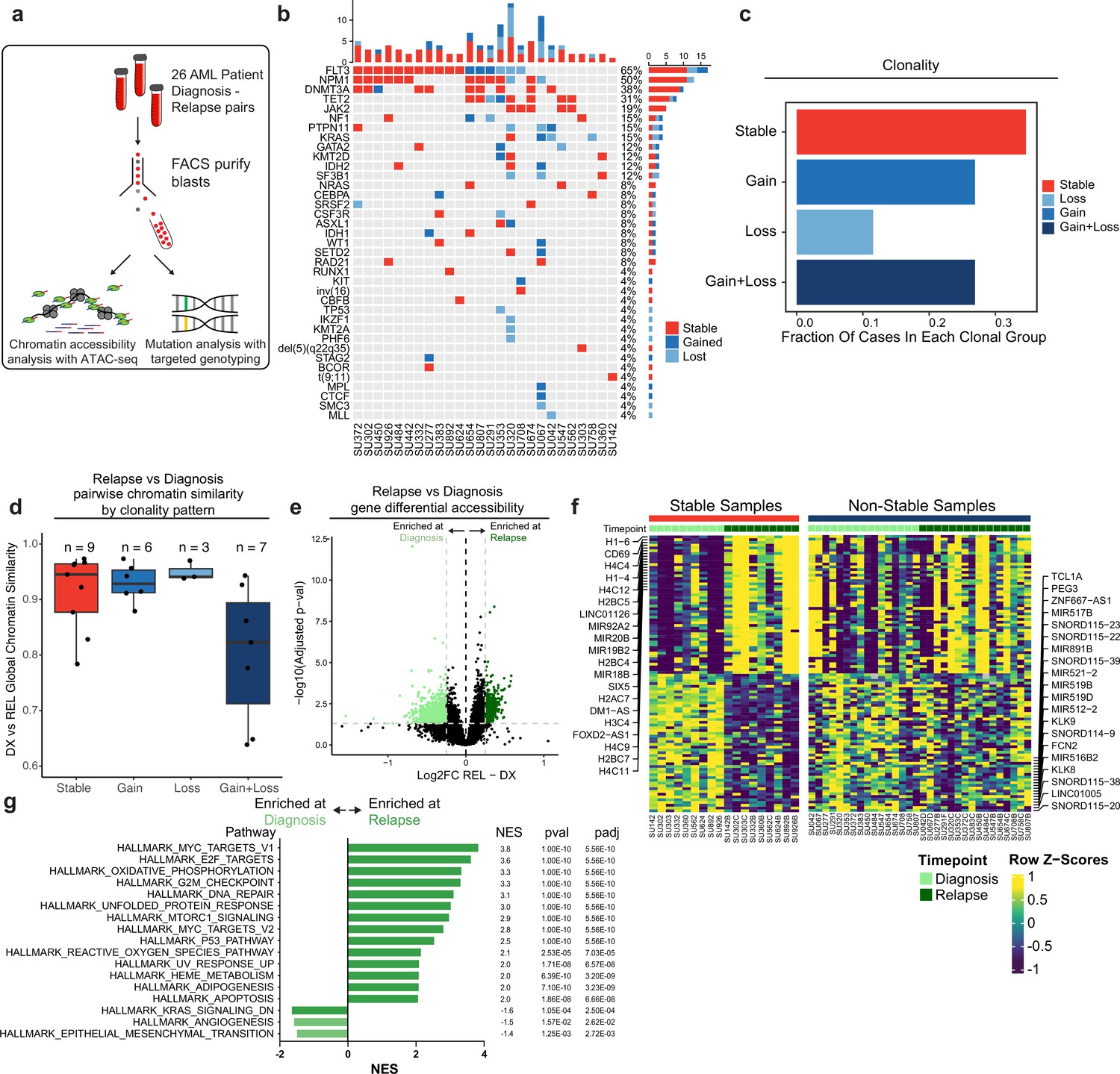
Chromatin accessibility change in stable and non-stable relapsed AML.
(a) Schematic of relapse sample acquisition and preparation. (b) Oncoprint of recurrently mutated genes in samples analyzed from Stanford University patient cohort (n=26). (c) Bar chart depicting fractions of patients from Stanford patient cohort in each clonal bin. (d). Violin plot depicting global chromatin accessibility similarity of diagnosis/relapse pairs based on ATAC-seq data. Each dot represents a value calculated for each patient based on overall chromatin accessibility similarity between diagnosis and relapse samples. (e) Volcano plot depicting differentially accessible genes at relapse in patients within the Stable clonal bin. (f) Heatmap depicting the accessibility of the top differential genes at diagnosis and relapse in mutationally stable samples Left: Accessibility displayed for stable samples. Right: accessibility displayed for non-stable samples. (g). Gene set enrichment analysis (GSEA) of differentially open or closed accessible genes calculated with ATAC-seq gene scores in mutationally stable samples. Top enriched or de-enriched pathways crossing significance threshold of padj <0.05 are shown.
Figure 2—figure supplement 1

Relapse-free-survival and differential chromatin analysis of the Stanford AML cohort.
(a) Time to relapse analysis of Stanford cohort patients according to clonality assessed by driver mutation genotyping. (b) Volcano plot of differential accessibility between diagnosis and relapse across all ATAC-seq peaks in genomically stable samples. Peaks considered significantly up or down-regulated if adjusted p-value < 0.05 and absolute log2 fold change >0.25. (c) Plot depicting fold change in accessibility of tiled 100 kb bins on chromosome 6 across stable samples at relapse. Dots indicate single bin fold change at relapse and red line shows the running fold change average across bins. Genes that were found to be significantly differential in accessibility are labeled at the bottom of the plot. (d) Heatmap of motif accessibility at diagnosis and relapse for genomically stable samples. Only the top 40 differentially accessible motifs are shown.
Figure 2—figure supplement 2

Projection of bulk AML ATAC samples to healthy hematopoietic single-cell manifold demonstrates shifts in epigenetic differentiation states at relapse.
(a) Healthy cell reference manifold projection of single-cell ATAC-seq data from Granja et al., 2019. Healthy hematopoietic cell categories color coded according to key shown below. (b) Bulk AML ATAC-seq data ‘pseudo’-single cell profiles projected to healthy hematopoietic reference umap. Projected cells are colored either by sorted cell population (left) or time of acquisition (right). (c) Projection of bulk AMLs from two patients using pseudo-single cell approach. Diagnosis samples shown in blue, relapse samples shown in red. (d) Plot depicting the change in projection between diagnosis and relapse across all samples. Arrows connect the average projection location of diagnosis cells to the average projection location of relapse cells for each patient. (e) Distribution of the closest mapped cell type across all AML Blast (non-LSC enriched) samples. Diagnosis and relapse distributions were compared using a fisher’s exact test.
Figure 3 with 1 supplement
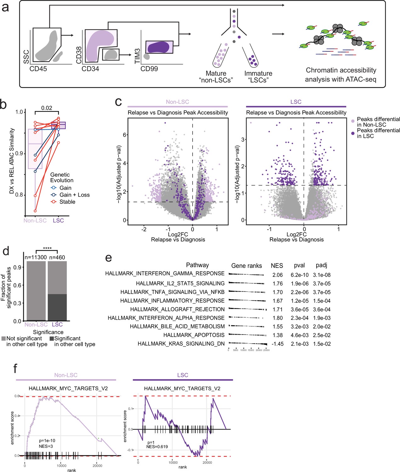
Chromatin change in relapsed AML LSCs.
(a) Cell sorting and library preparation scheme for comparison of chromatin accessibility profiles of LSC vs. non-LSC enriched subpopulations in relapsed AML cohort. (b) Box and whisker plot depicting chromatin accessibility correlation coefficient for non-LSCs vs. LSCs. Lines connect LSC similarity and non-LSC similarity values for each patient. (c) Volcano plot of differentially accessible peaks between diagnosis and relapse in non-LSCs (left) or in LSCs (right). The top 200 differential peaks by log2FC in LSCs (dark purple) and non-LSCs (light purple) are highlighted in each plot. Cutoffs for adjusted p value of<0.05 are depicted as dashed lines in both plots. (d) Bar plot comparing fraction of significantly differentially accessible peaks in non-LSCs that were also differentially accessible in LSCs and vice versa. (e) Gene set enrichment analysis (GSEA) of differentially open or closed accessible genes calculated using gene scores from ATAC-seq data from LSC samples. A positive NES indicates that the pathway was upregulated at relapse relative to diagnosis based on the gene accessibility data. Top pathways crossing significance threshold of padj <0.05 are shown. (f) GSEA plot of exemplar gene pathway enriched in bulk Stable ATAC-seq samples (HALLMARK_MYC_TARGETS_V2) applied to either non-LSC gene score data set (left) or LSC gene score data set (right).
Figure 3—figure supplement 1
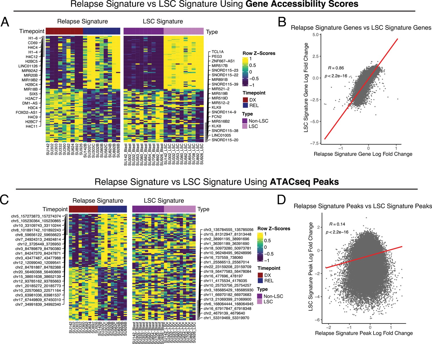
Comparison between AML relapse signature and LSC signature.
Relapse signatures were derived by comparing relapse timepoints to diagnosis timepoints in stable AML patients. LSC signatures were derived by comparing LSCs to non-LSC populations at diagnosis across patients with sortable LSC populations. Relapse chromatin changes were compared to LSC chromatin changes using gene accessibility scores. (A) Heatmap of the most differential gene accessibility scores in relapse samples at diagnosis and relapse timepoints (left), and LSC vs Non-LSC populations (right). (B) Dot-plot depicting the correlation between relapse signature gene accessibility score fold changes and LSC signature gene accessibility score fold changes.
Figure 4 with 2 supplements
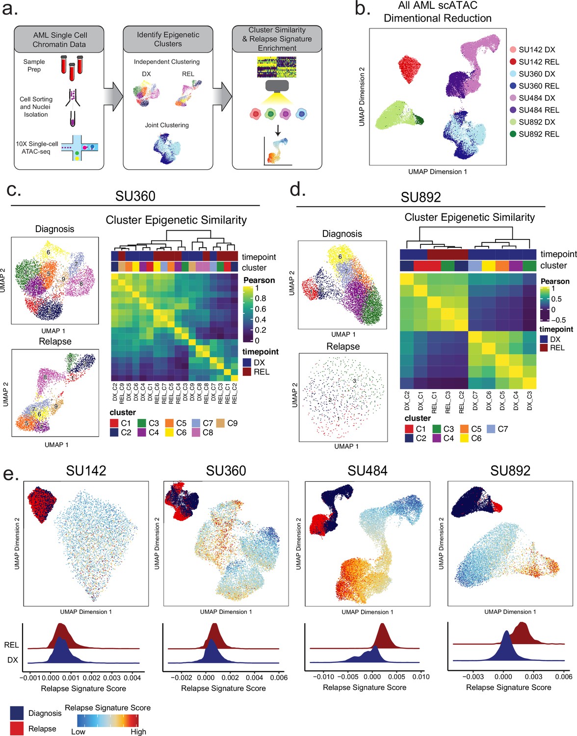
Single-cell ATACseq analysis of relapsed AML.
(a) Scheme for single-cell ATAC-seq sample preparation and cell clustering analysis (b) UMAP projection of all single-cell ATAC-seq patient samples from Stanford diagnosis/relapse cohort (samples color-coded according to scheme at right). (c–d) Cell clustering analysis of Stanford patient samples SU360 (c) and SU892 (d). At left, UMAP plots of individual samples from each patient with color-coded cell clusters shown; at right, non-hierarchical clustering heatmap of determined cell clusters. (e) UMAP projections of single-cell ATAC-seq from patient samples showing heat signature for Stable sample relapse ATAC-seq signature (from Figure 2). Inset UMAP shows cells colored according to diagnosis or relapse samples. Overall relapse score for each sample is quantified in plots at the bottom.
Figure 4—figure supplement 1
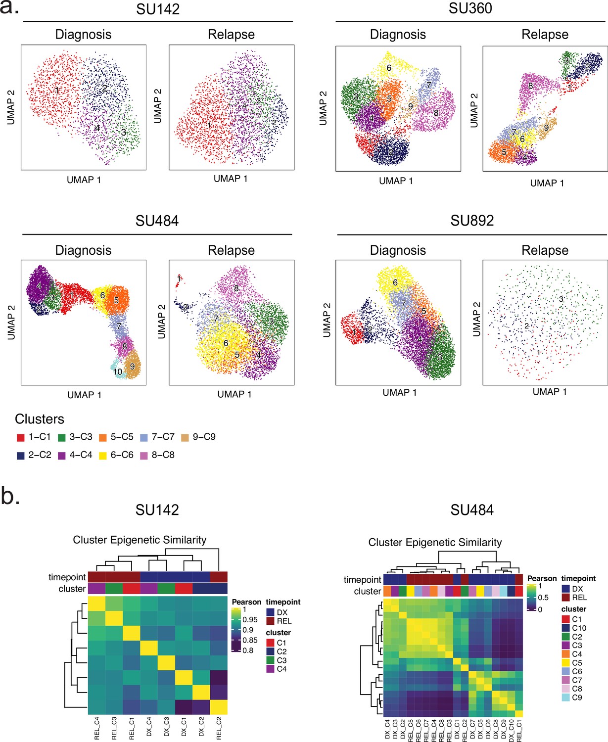
Single-cell SNN clusters and between-cluster epigenetic similarities.
(a) UMAP plots of clustering analyses performed for the four patient samples indicated (diagnosis sample at left, relapse at right). (b) Hierarchical clustering analysis of scATAC-seq data from diagnosis and relapse cell clusters from patients SU142 (left) and SU484 (right).
Figure 4—figure supplement 2
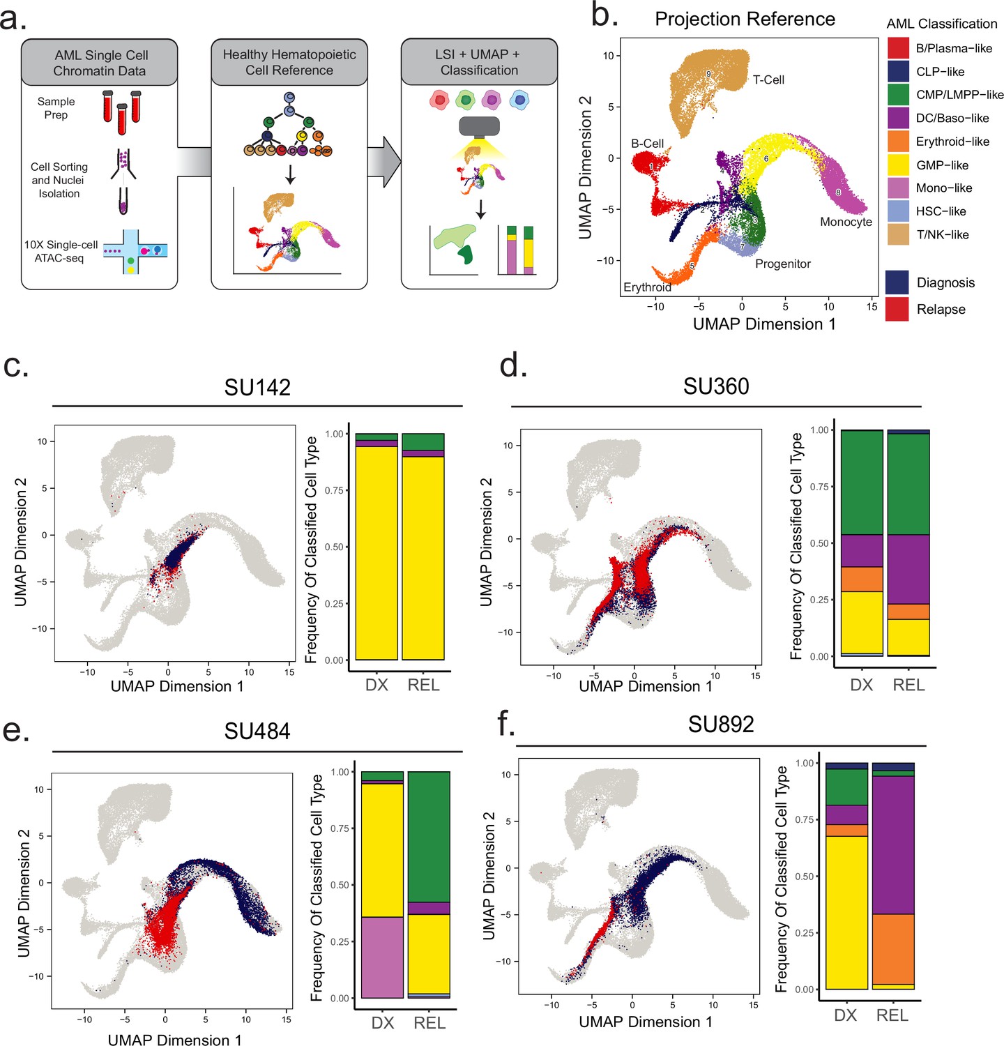
Projection of AML scATAC samples to healthy hematopoietic single-cell manifold demonstrates shifts in epigenetic differentiation states at relapse.
(a) Schematic of strategy for healthy cell LSI projection analysis of single-cell ATAC-seq diagnosis/relapse data (b) Healthy cell reference of single-cell ATAC-seq data from Granja et al Nat. Granja et al., 2019. Healthy hematopoietic cell categories color coded according to key shown at bottom. (c–f) UMAP projections of single-cell ATAC-seq samples onto healthy cell reference manifolds for indicated patients. Barplot of nearest cell type classification fractions across all cells at diagnosis and relapse is shown for each patient.
Figure 5 with 2 supplements
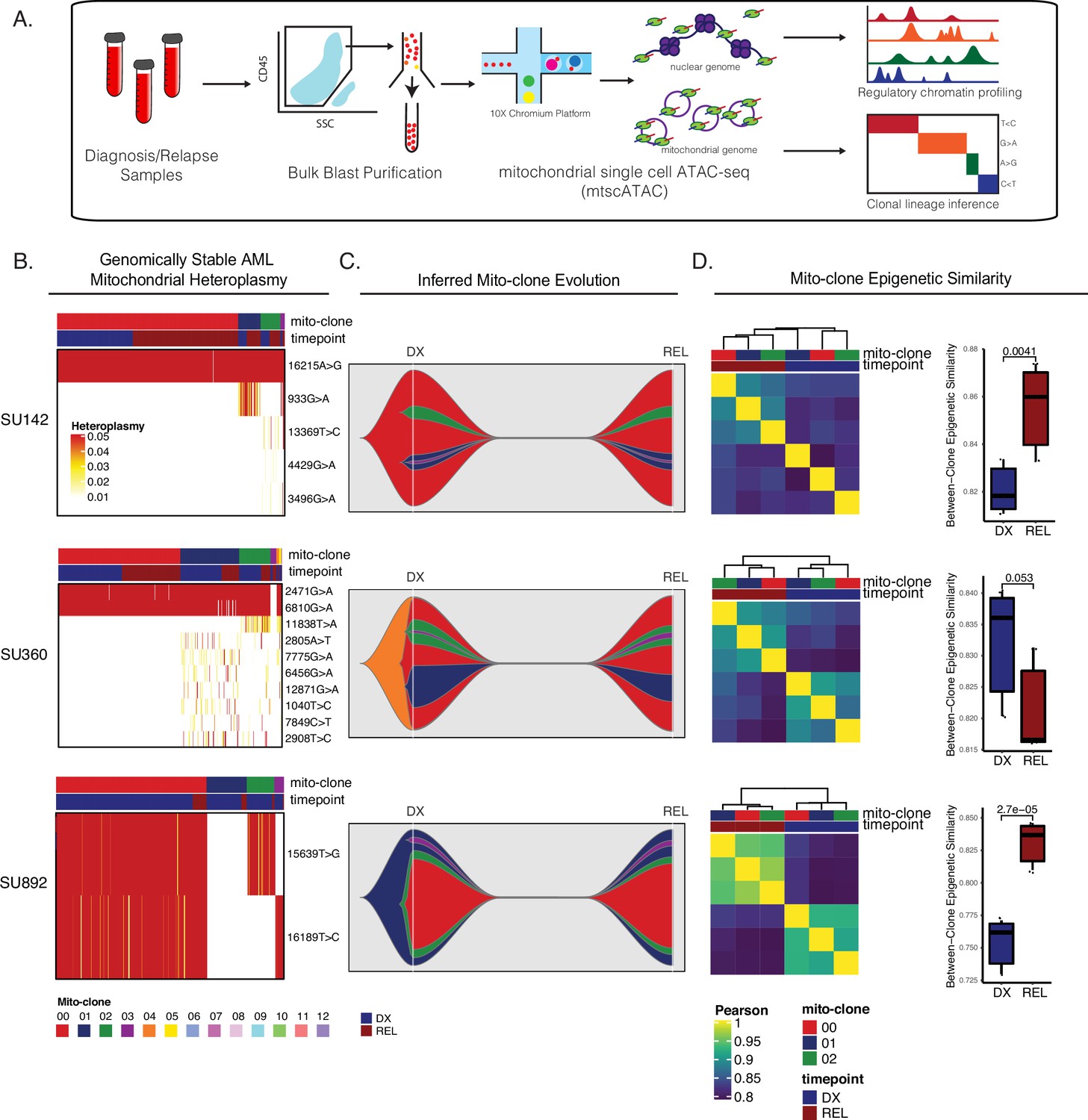
Mitochondrial-based clonal tracing paired with single-cell chromatin accessibility in stable AMLs.
(a) Scheme for sample processing and analysis of mitochondrial single-cell ATAC-seq (mtscATAC-seq). (b) Heatmap of mitochondrial variant heteroplasmy values across all single cells for each genomically stable sample. Only variants passing filtering criteria are shown. Cells are ordered based on the cluster they are assigned to. (c) Fishplots of inferred mitochondrial clone evolution at diagnosis and relapse based on mitochondrial cluster frequencies in (B). (d) Heatmap of epigenetic similarity across all major mitoclones for each sample (left). Boxplot of inter-clone epigenetic similarity at diagnosis and relapse (means compared using unpaired student’s t-test) (right).
Figure 5—figure supplement 1
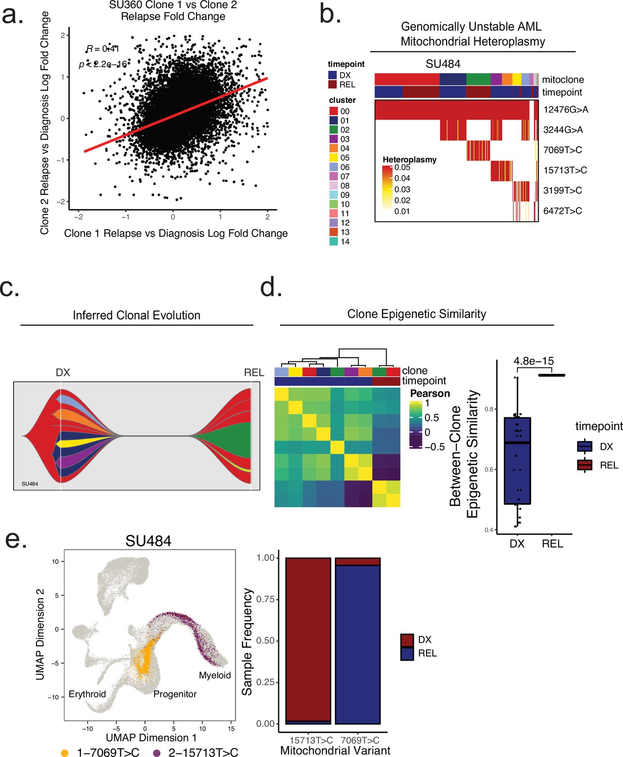
Mitochondrial-based clonal tracing paired with single -cell chromatin accessibility in a genetically non-stable AML.
(a) Comparison of relapse vs diagnosis accessibility fold change across all peaks between mitoclone 1 and mitoclone 2 in SU360 (R=0.41, p<2.2e-16). (b) Heatmap of mitochondrial variant heteroplasmy values across all single cells for SU484. Only variants passing filtering criteria are shown. Cells are ordered based on the cluster they are assigned to. (C) Fishplot of inferred mitochondrial clone evolution at diagnosis and relapse based on mitochondrial cluster frequencies in (B). (D) Heatmap of epigenetic similarity across all major mitoclones (left). Boxplot of inter-clone epigenetic similarity at diagnosis and relapse (means compared using unpaired student’s t-test) (right). (e) LSI projection of cells containing either 7069T>C or 15,713T>C mitochondrial variants to the healthy hematopoietic reference umap (left). Barplot depicting frequency of cells from diagnosis or relapse timepoints containing either 7069T>C or 15,713T>C variants (right).
Figure 5—figure supplement 2
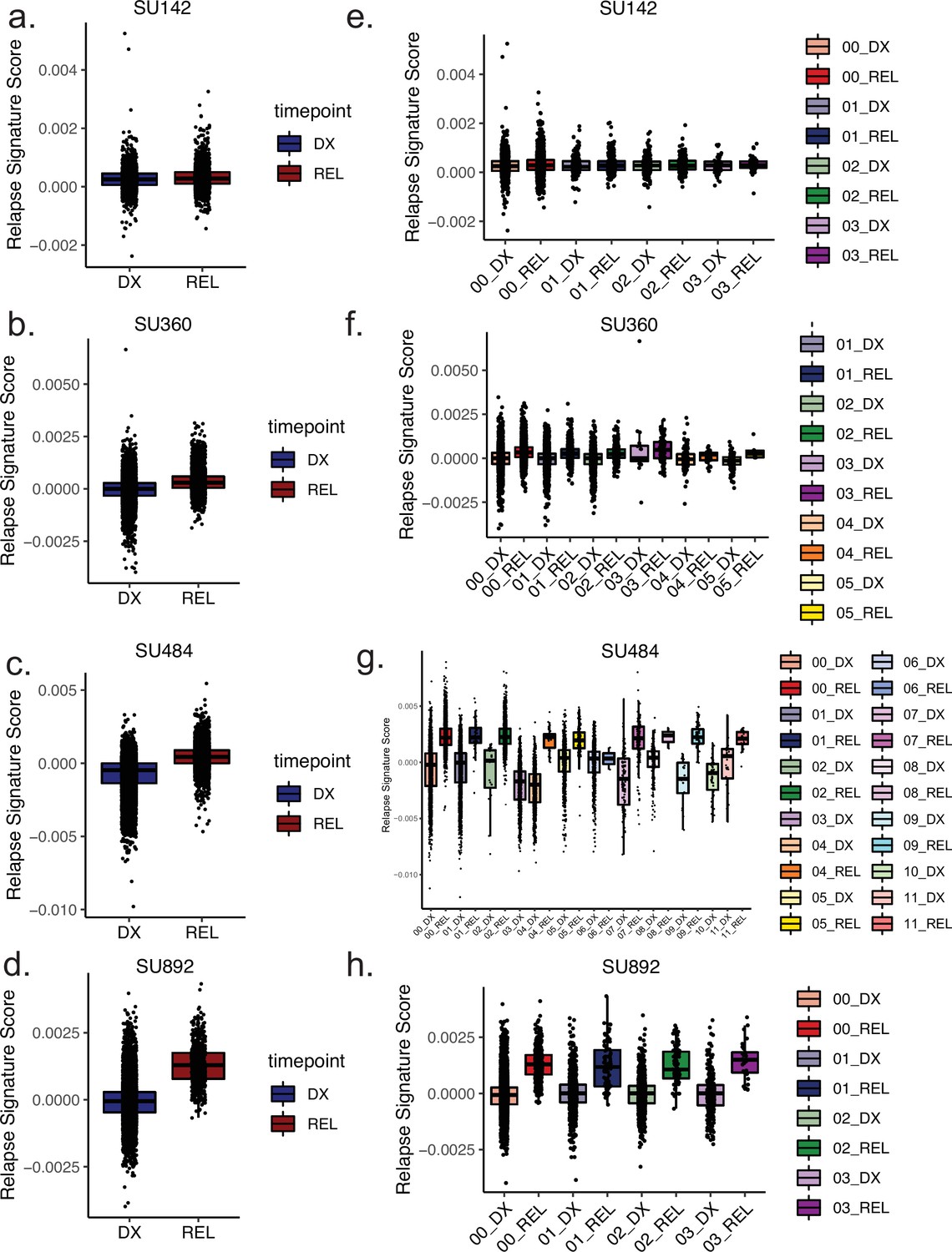
Clone-specific epigenetic relapse scores at diagnosis and relapse timepoints.
(a–d) Box plots depicting relapse signature ATAC-seq score calculated for single cells for the indicated patients according to timepoint, diagnosis (left) shown in blue, relapse (right) shown in red. (e–h) Box plots depicting relapse signature score calculated for single cells sorted according to mitoclone designation using mtscATAC-seq for indicated patients. Clones are defined and colored according to the keys shown at right for both diagnosis and relapse samples.
Author response image 1
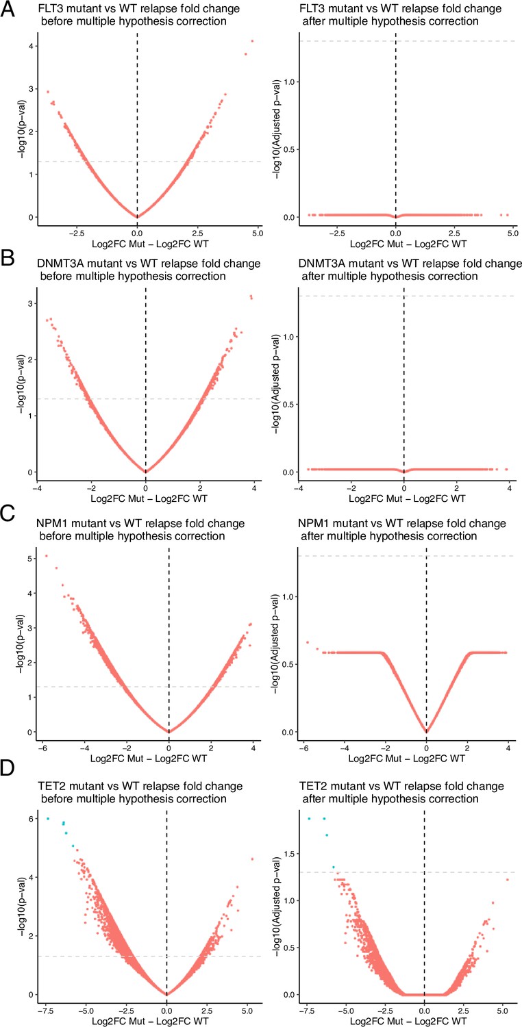
Volcano plots of differential analysis between mutant vs wildtype of relapse vs diagnosis fold change.
Mutations analyzed include (A) FLT3, (B) DNMT3A, (C) NPM1, (D) TET2. Volcano plots are displayed with unadjusted (left) and adjusted (right) p values. In all analyses but one, p-value adjustment resulted in no significant gene loci chromatin evolution differences. In TET2-mutant samples, 5 loci remained differential after multiple-hypothesis testing correction.
Additional files
-
Supplementary file 1
Supplementary meta-analysis, clinical, treatment, and genotyping data.
(a) List of all publicly available studies utilized in the meta-analysis of relapsed AML genomics. (b) Clinical, treatment, and karyotype information for all patients in the study. (c) Summary of all genotyping information for all paired diagnosis and relapse samples in the study. (d) Detailed genotyping information for all paired diagnosis and relapse samples in the study. (e) Bulk ATAC-seq gene score differential accessibility results from stable AML analysis.
- https://cdn.elifesciences.org/articles/93019/elife-93019-supp1-v1.xlsx
-
MDAR checklist
- https://cdn.elifesciences.org/articles/93019/elife-93019-mdarchecklist1-v1.pdf
Download links
A two-part list of links to download the article, or parts of the article, in various formats.
Downloads (link to download the article as PDF)
Open citations (links to open the citations from this article in various online reference manager services)
Cite this article (links to download the citations from this article in formats compatible with various reference manager tools)
Convergent epigenetic evolution drives relapse in acute myeloid leukemia
eLife 13:e93019.
https://doi.org/10.7554/eLife.93019


